Client
TeachNZ is a national Ministry of Education initiative supporting people considering teaching, current teachers and school leaders.
Problem
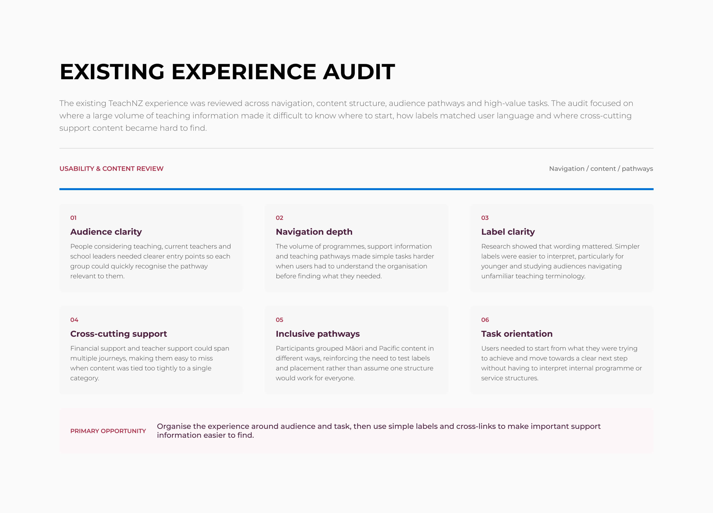
TeachNZ needed to become a clearer one-stop shop for teaching information. The experience served people at very different stages, but the volume and structure of content made it difficult to know where to start or where specific information belonged.
Strategic framing
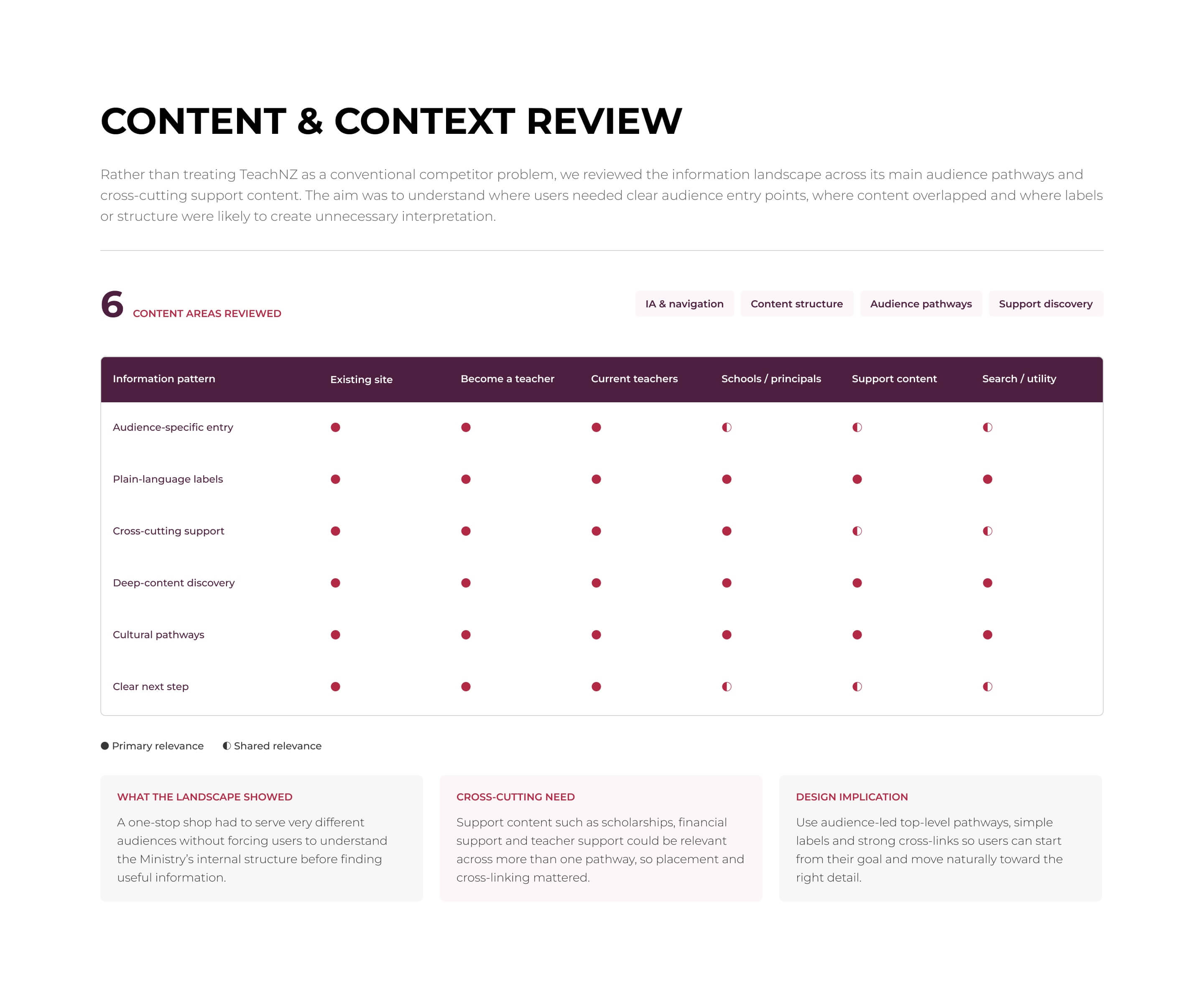
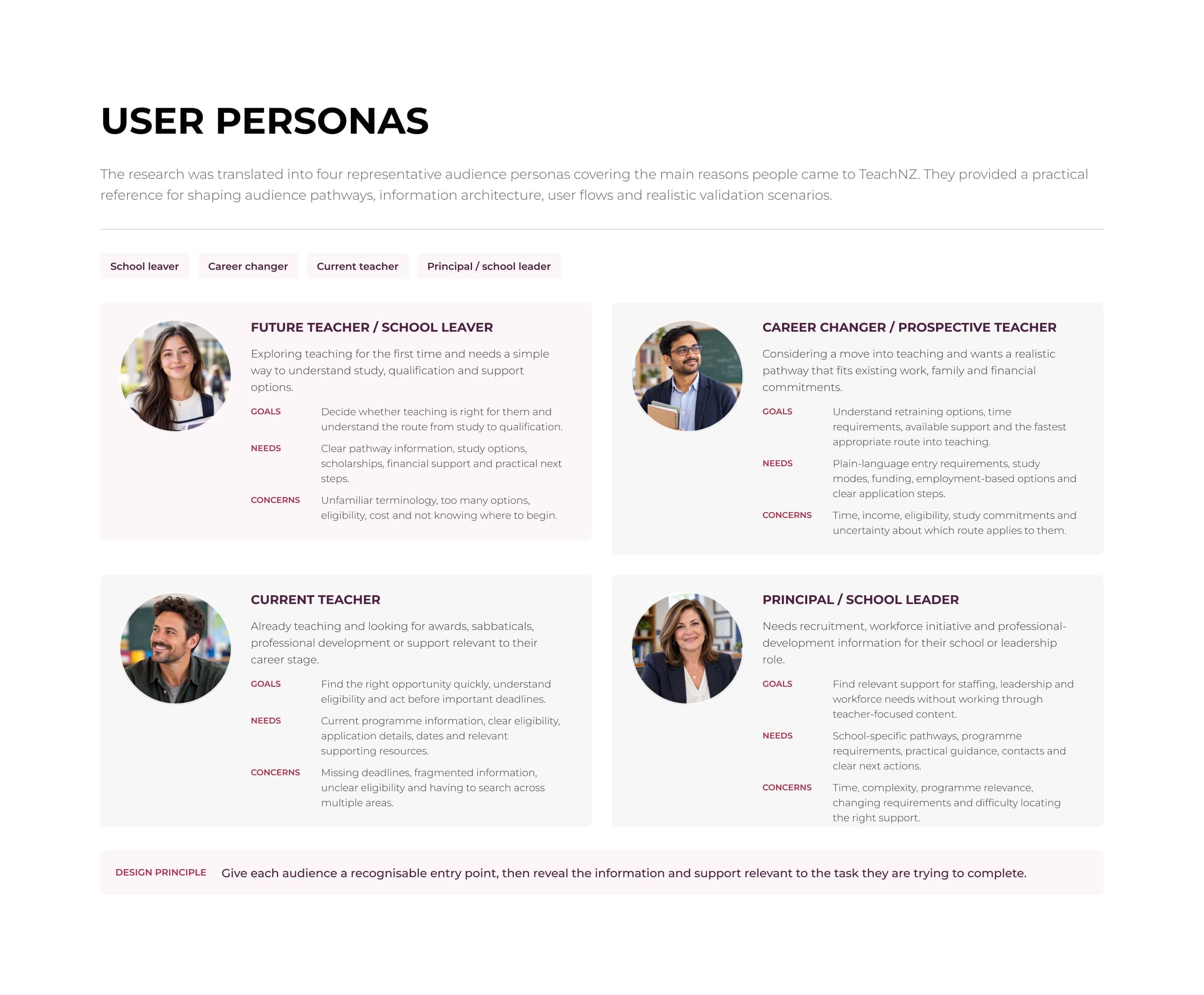
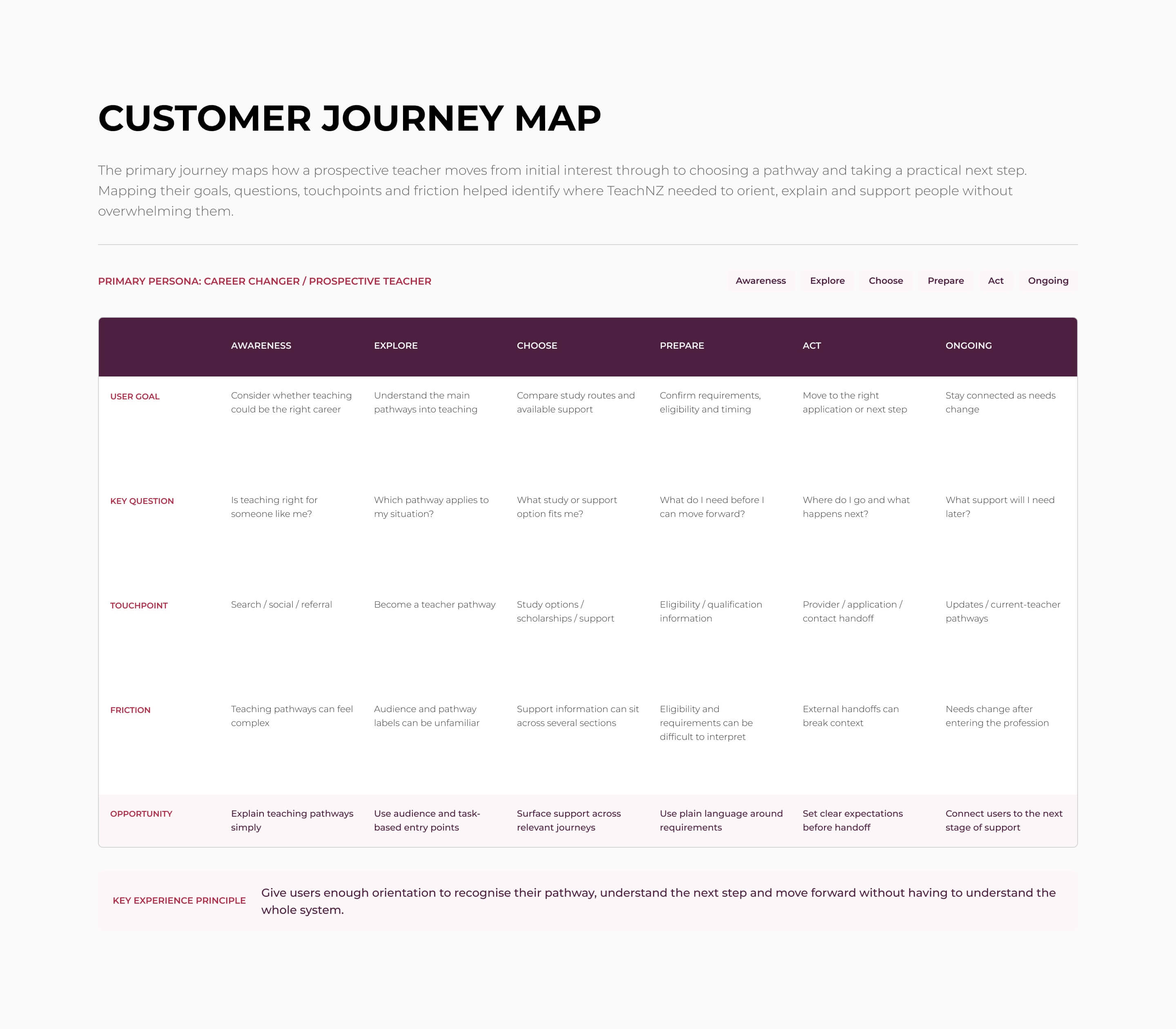
Get prospective teachers, current teachers and school leaders who are navigating their way into or through the profession to find a clear path forward, by turning a complex information landscape into audience-led, user-tested pathways written in plain language, so the right guidance is easier to find when it matters most.
Solution
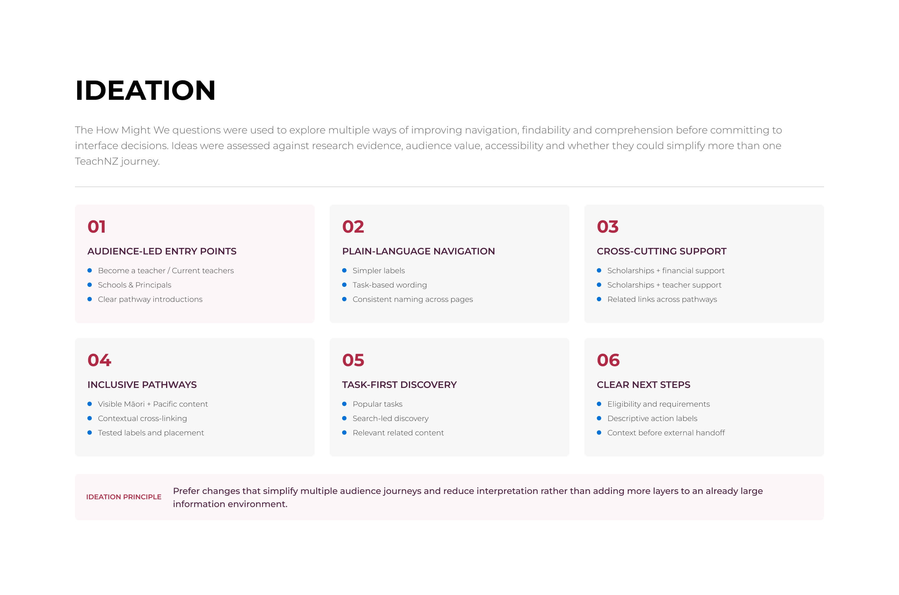
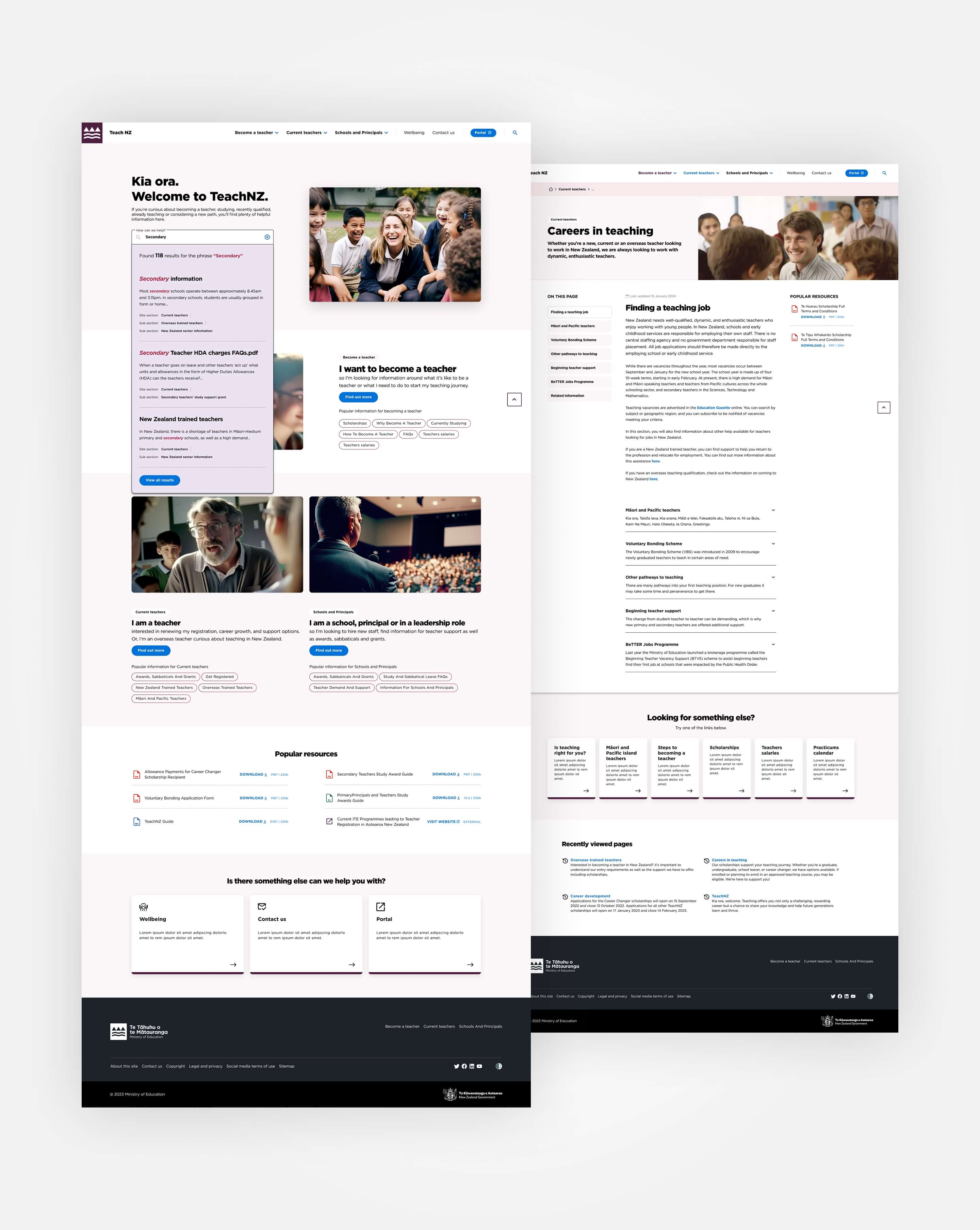
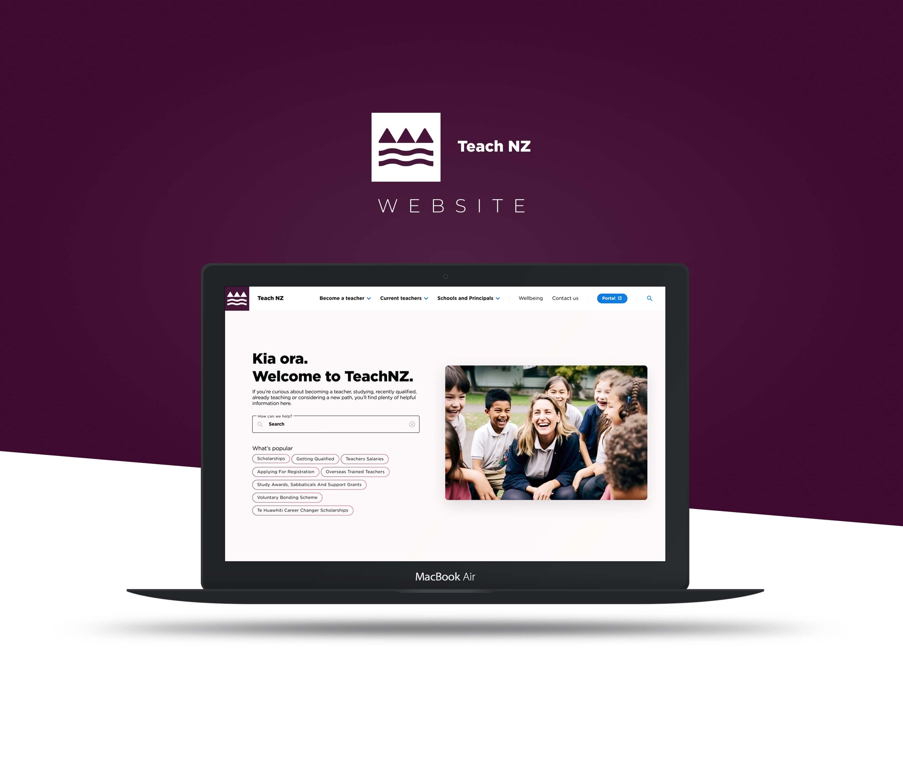
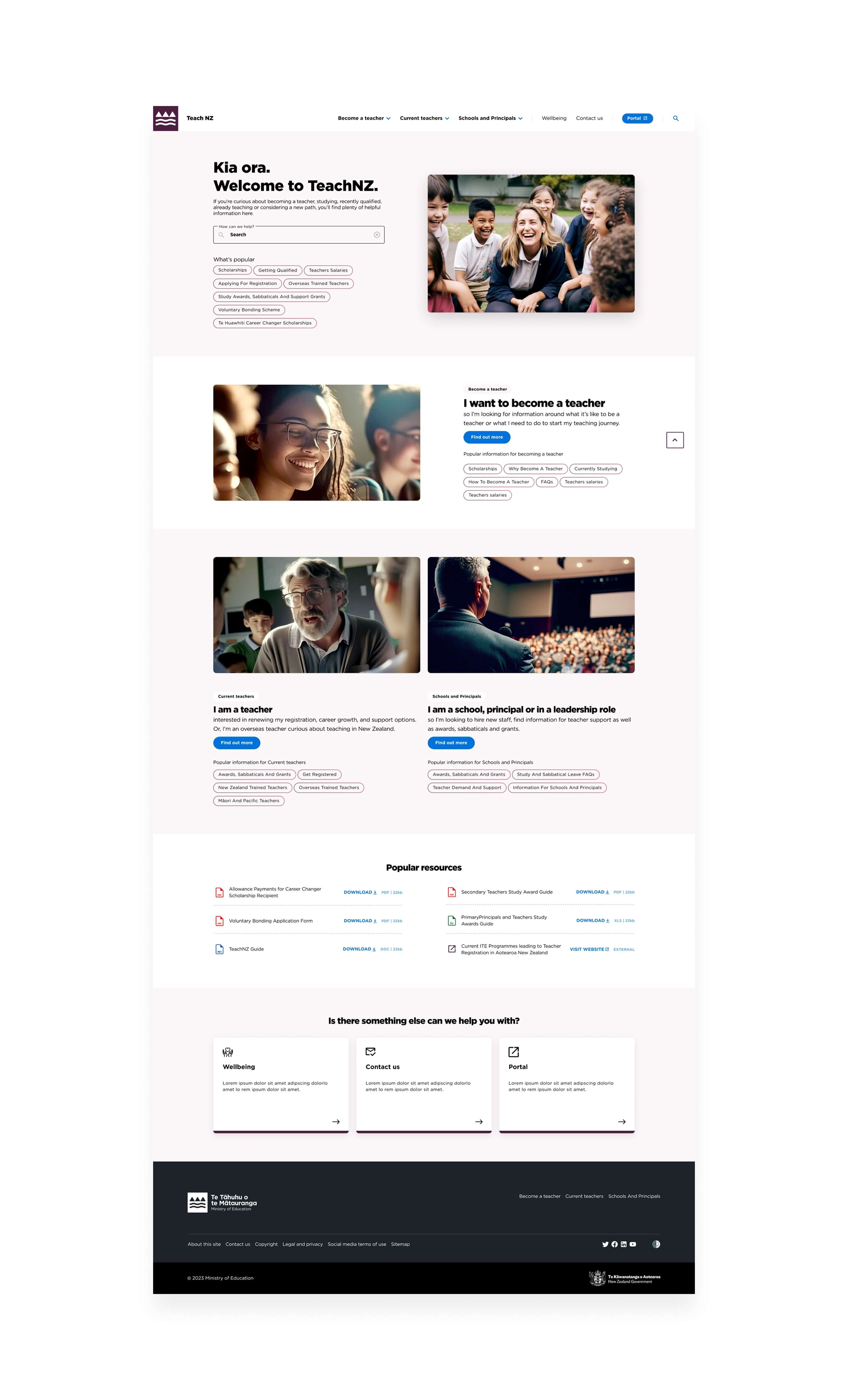
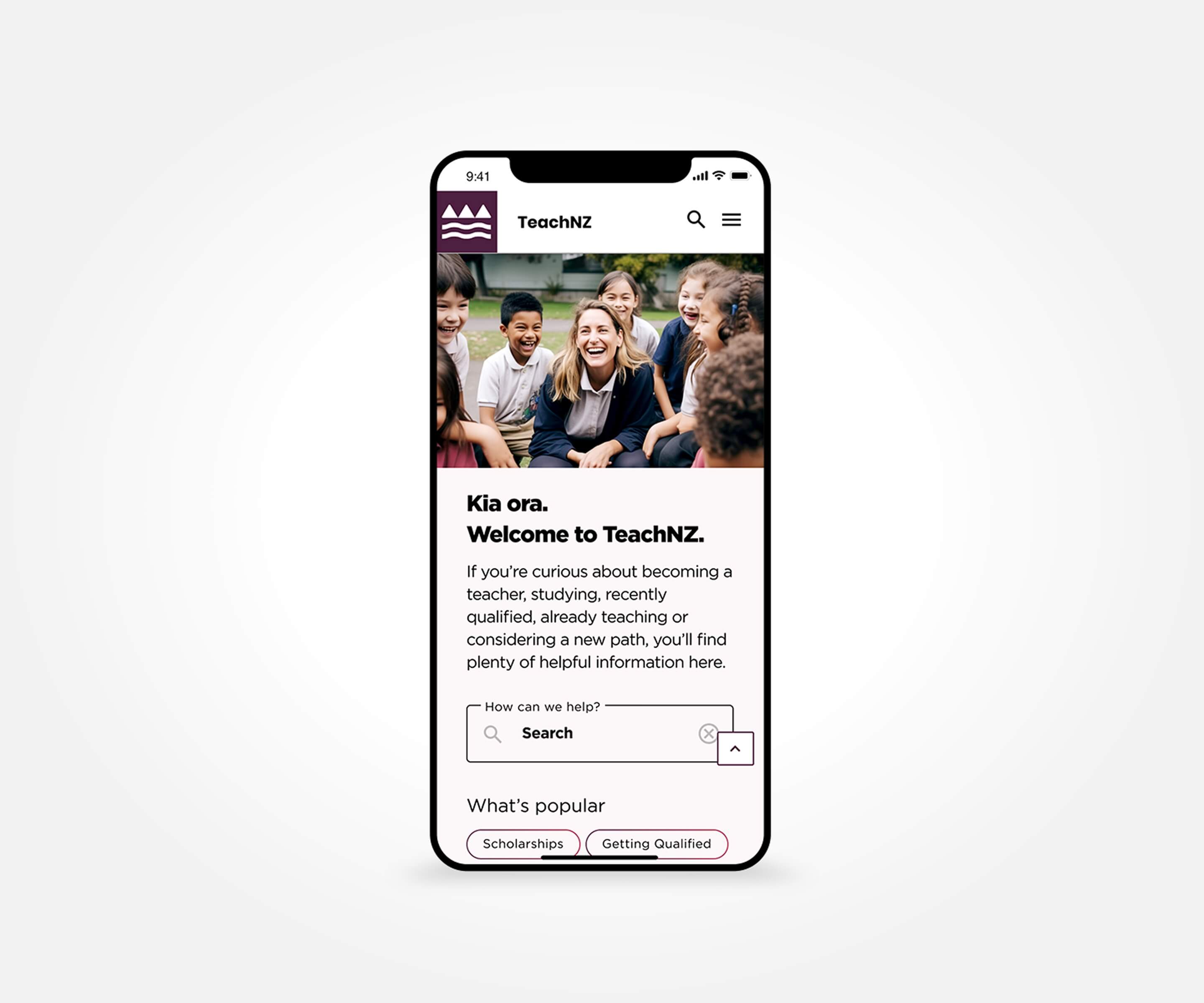
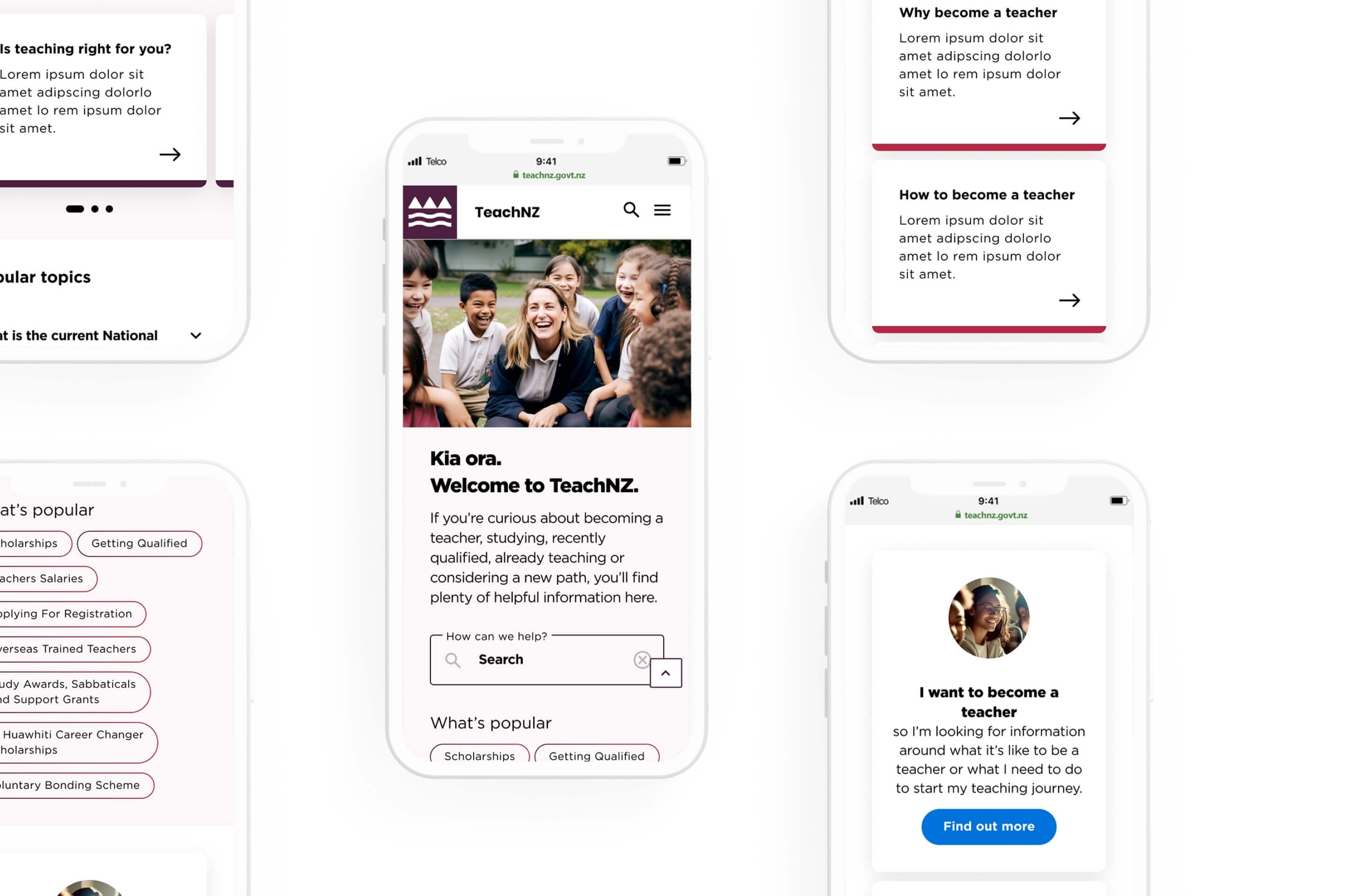
We turned a maze of teaching information into a clearer way forward. TeachNZ was rebuilt around the questions people actually arrive with, using audience-led pathways, search, popular content and direct access to high-value tasks. Card sorting, Treejack and goal-based testing exposed where the structure failed and reshaped the navigation and content structure into a consistent, accessible experience across desktop and mobile.
WEBSITE LAUNCHED JUNE 2024

Design System
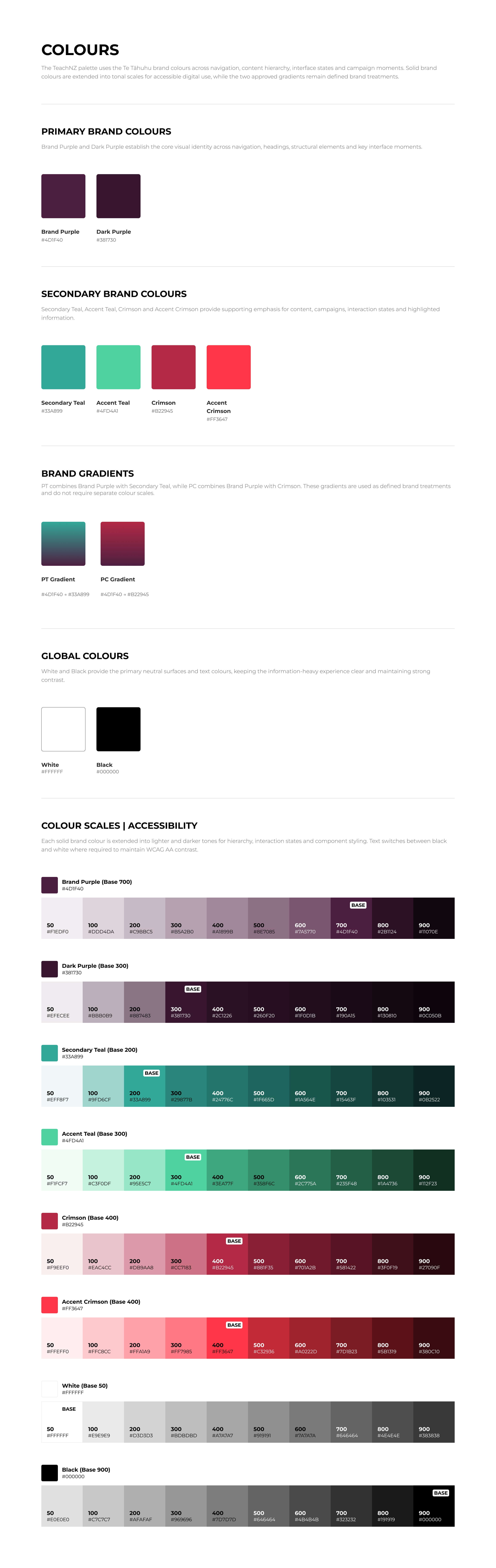
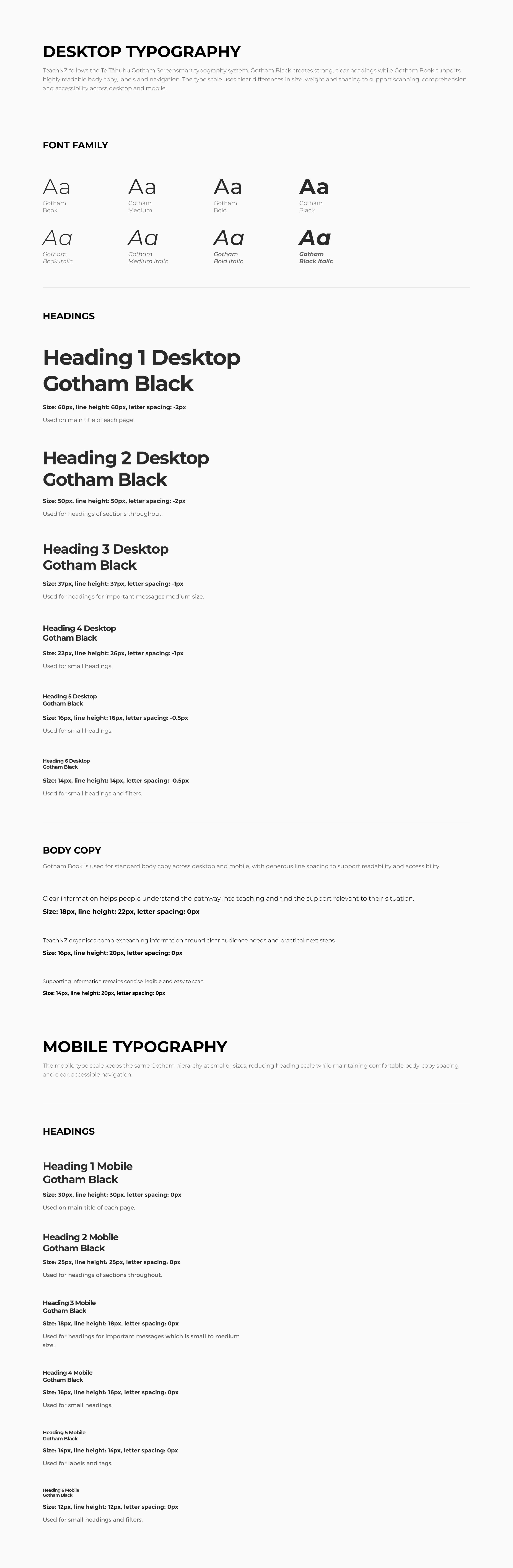
TeachNZ was designed within the existing Te Tāhuhu visual system rather than as a standalone brand experience.
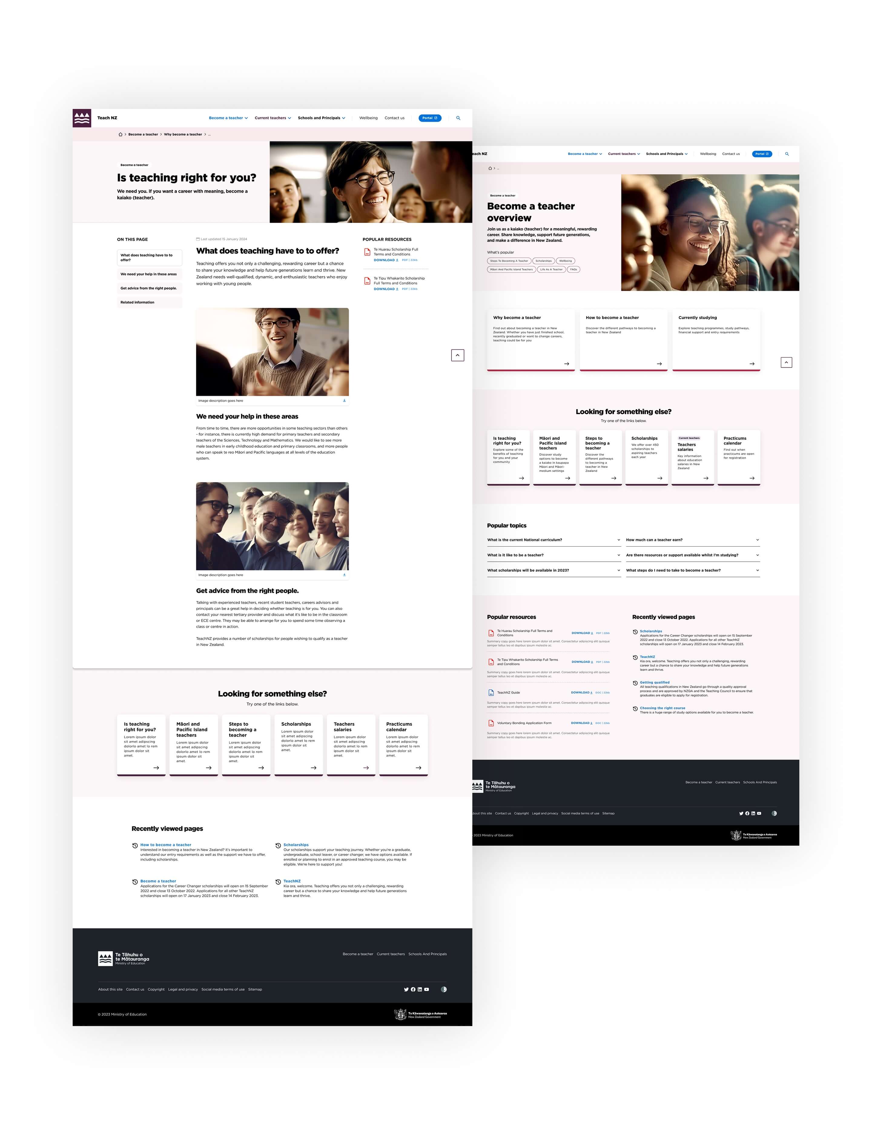
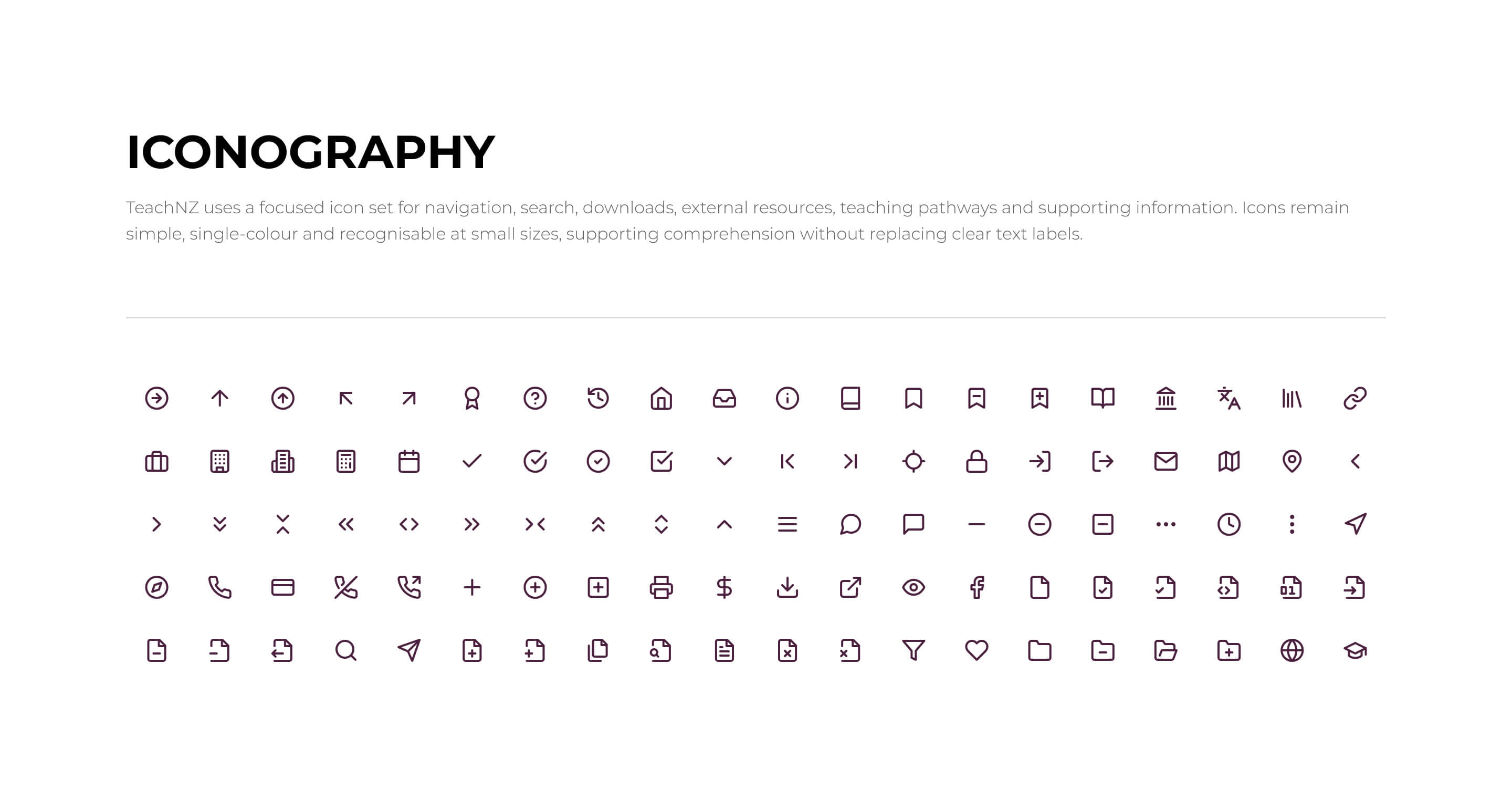
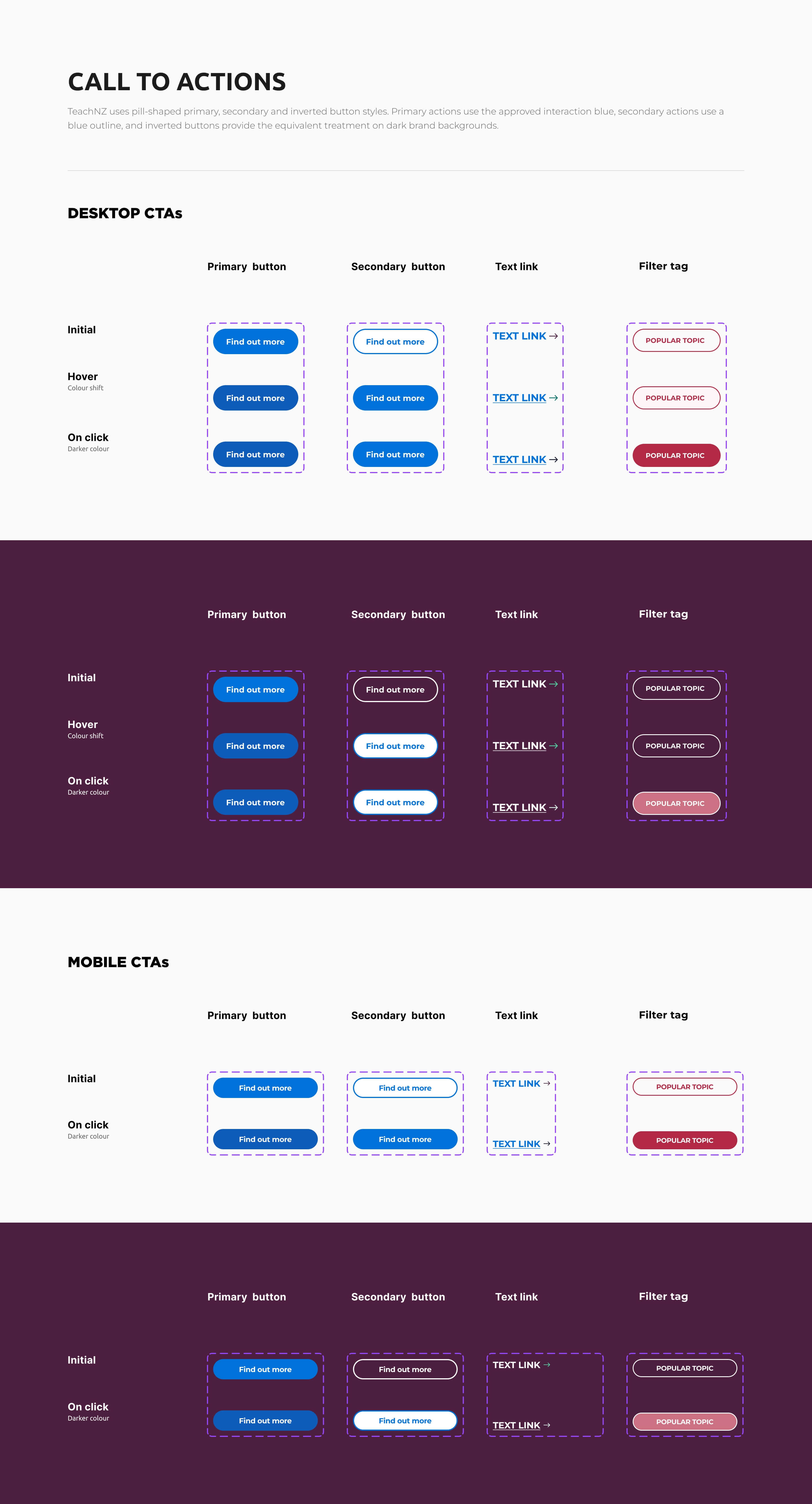
We extended the system with reusable components and patterns for audience-led navigation, search, popular-topic tags, content cards, calls to action and responsive layouts. This created consistency across a large information environment while keeping the experience readable, accessible and easy to maintain.
Shared styles and component behaviours also gave design and development a clearer common reference, making new pages and content easier to extend without introducing unnecessary variation.

UX Research & Design
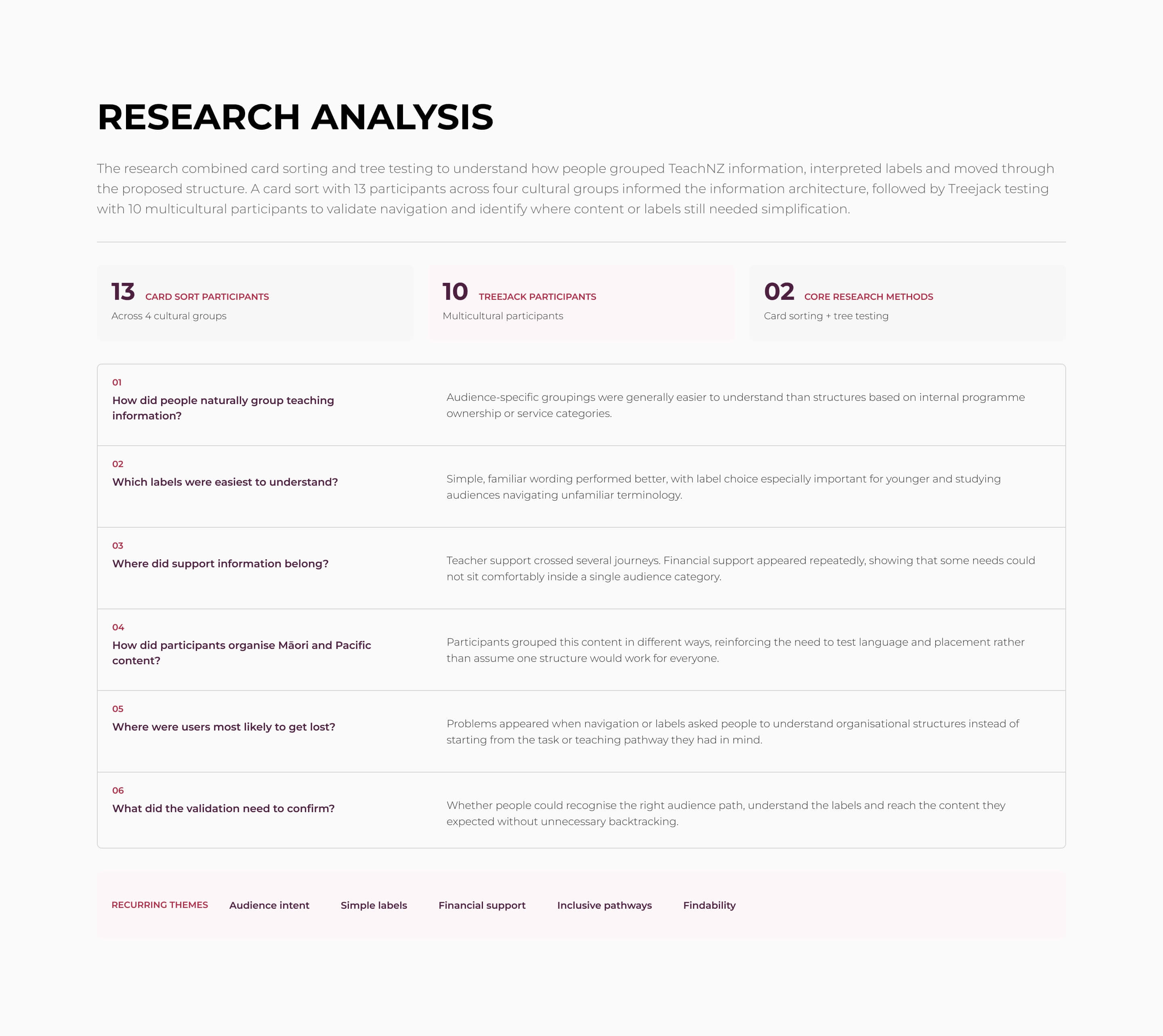
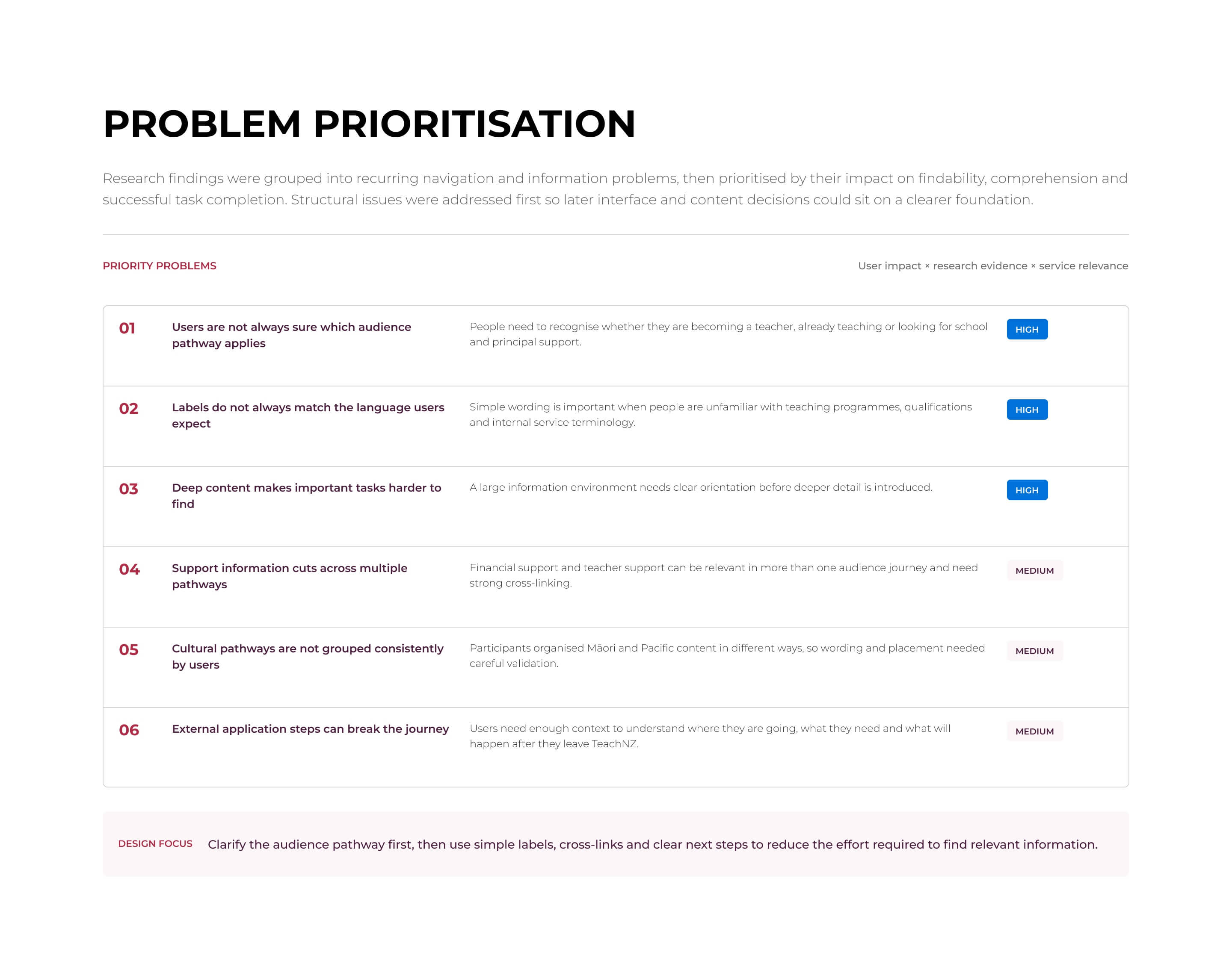
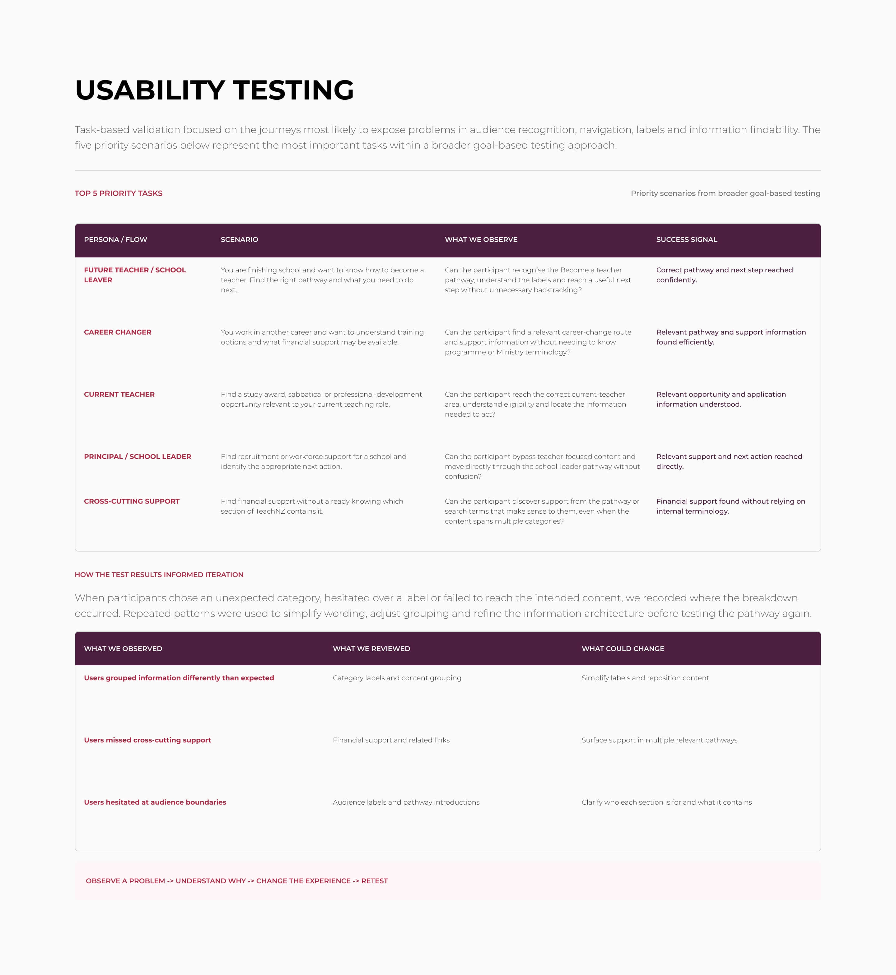
Research was central to reshaping the TeachNZ experience. A card sort with 13 participants across four cultural groups explored how people grouped teaching information, while Treejack testing with 10 multicultural participants tested whether the proposed structure helped users reach the right content.
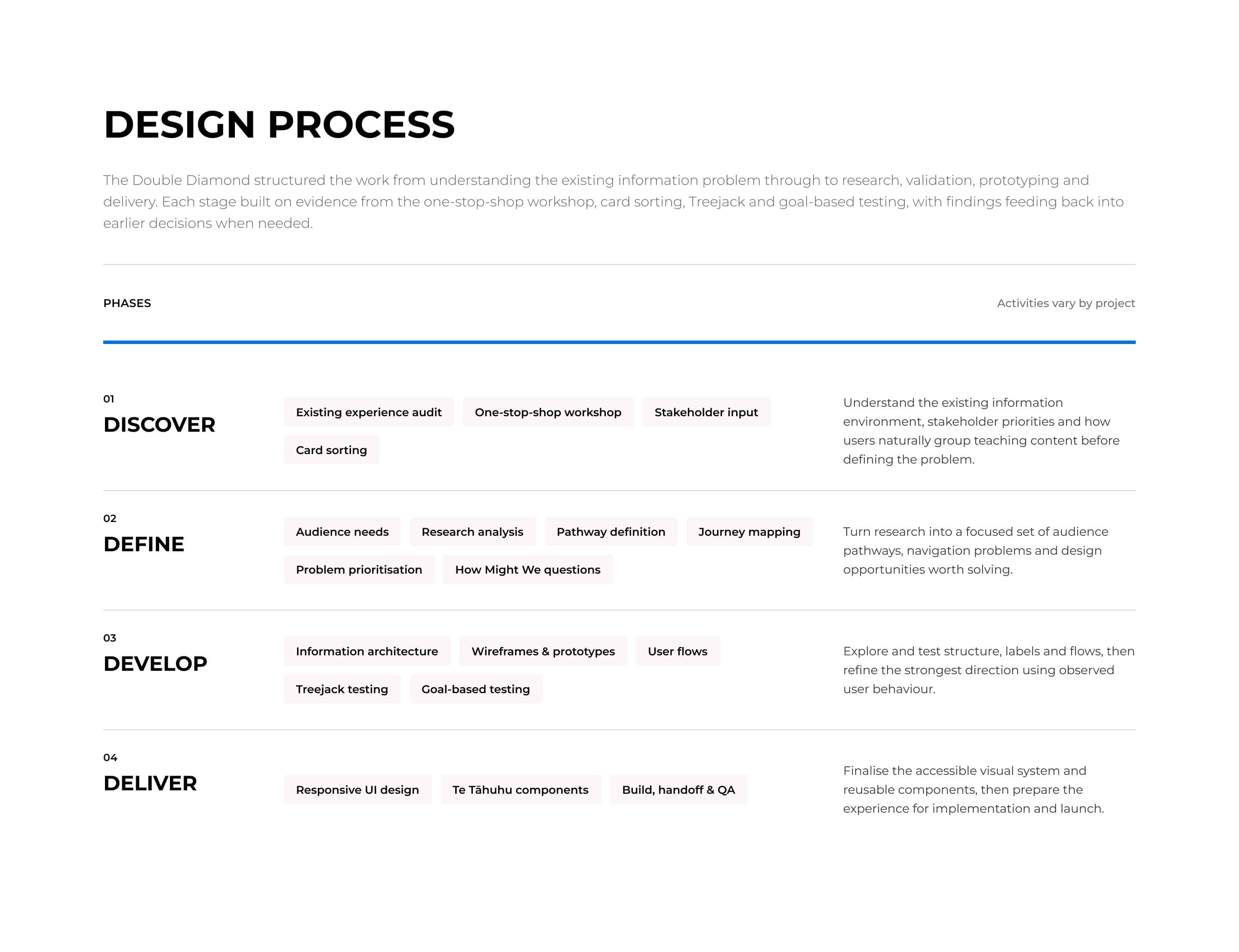
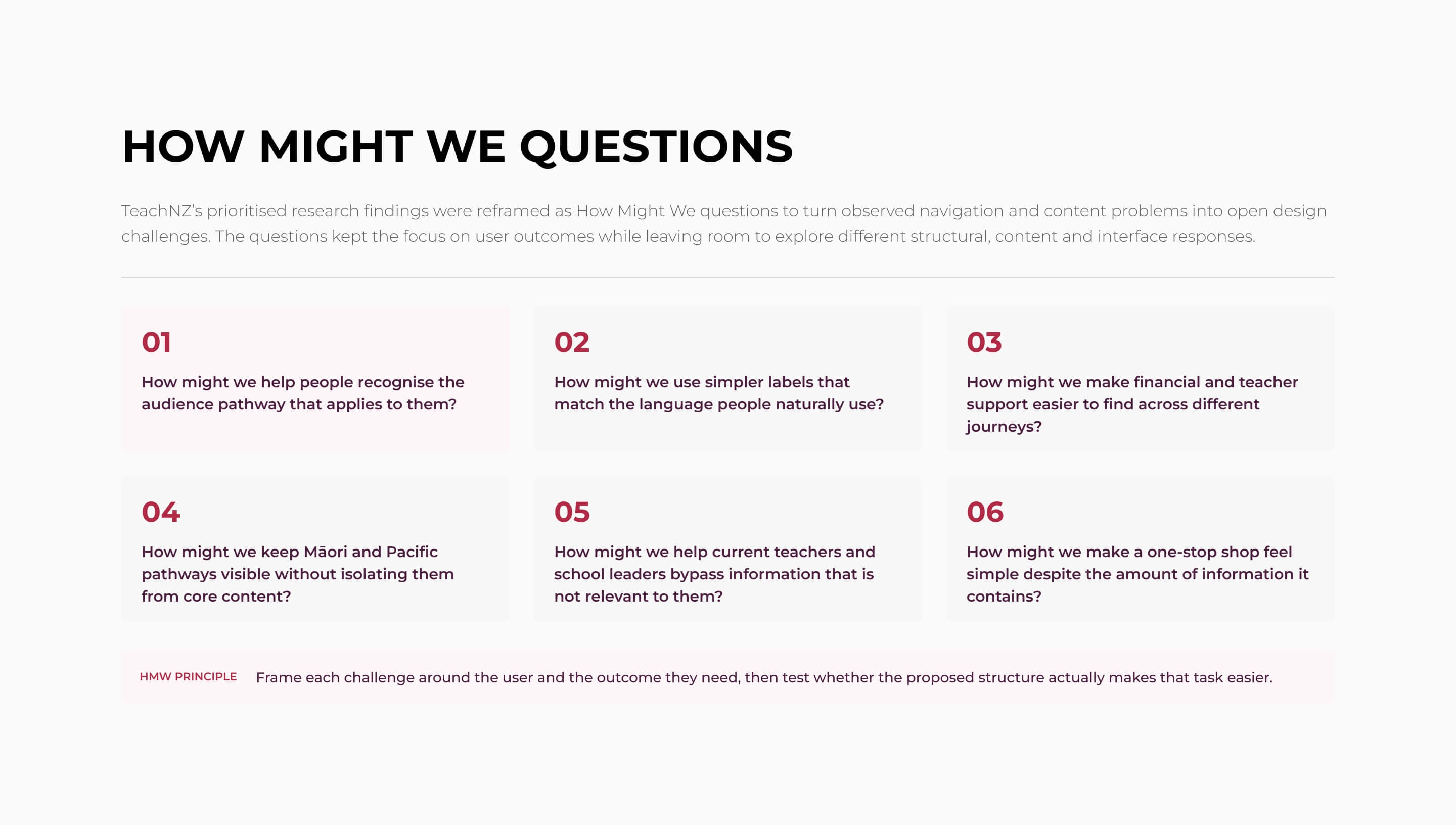
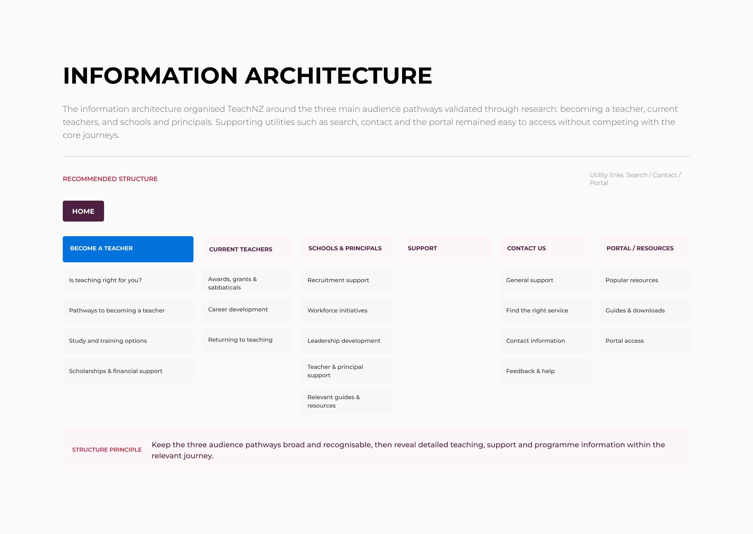
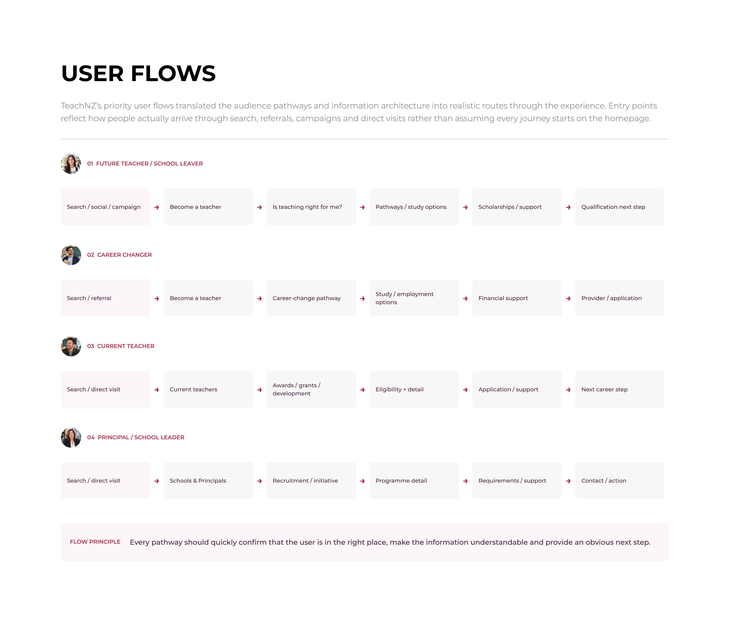
Each stage informed the next. Research findings shaped audience pathways, labels and information architecture, which were translated into wireframes and prototypes. Goal-based testing then helped identify where people were still getting lost or where navigation and content needed to be simplified.
The result was a clearer one-stop shop experience organised around how people looked for information, with stronger pathways for people becoming a teacher, current teachers, and schools and principals.